Color choice in a room impacts everything from mood to spatial perception. Colors have the incredible ability to create a sense of calm or excitement, draw focus to a particular spot, or make a room seem bigger than it is. In other words, it’s worth spending the time to get it right.
To create a cohesive look, start with a base color you love. The base color in a room can be any large element (or two) that anchors the space, be it a sofa, the wall color, or a rug. Unless you’re starting totally from scratch with an unlimited budget, the furniture or wallpaper you already have may determine what your base color is. That base color should account for roughly 60% of the total design.

A second, complementary color should then take up about 30% of the overall look. Think curtains, linens, or chairs. Finally, an unexpected accent color should be sprinkled in approximately 10% of the space. From framed art and travel souvenirs to throw pillows, this accent color is your chance to put your personality on full display.
TIP: Accent colors are the easiest to swap out seasonally or throughout the years as your taste evolves, so smaller elements like throw pillows and blankets are a savvy choice

Remember, this is your space. Nobody is coming over with a measuring tape and calculator to make sure you divvy up your decor in an exact 60-30-10 ratio. Use the numbers as simple guidelines, and then follow your instincts!
How to choose the right colors for your space:
- Choose a palette from the get-go. Again, there are no design police coming around to check on you, but it’s generally smart to stick to monochromatic (tone-on-tone), analogous (colors next to one another on the color wheel and which share the same undertones), or complementary (opposite colors which are located directly across from one another on the color wheel) color schemes. Having a plan helps to avoid visual chaos.
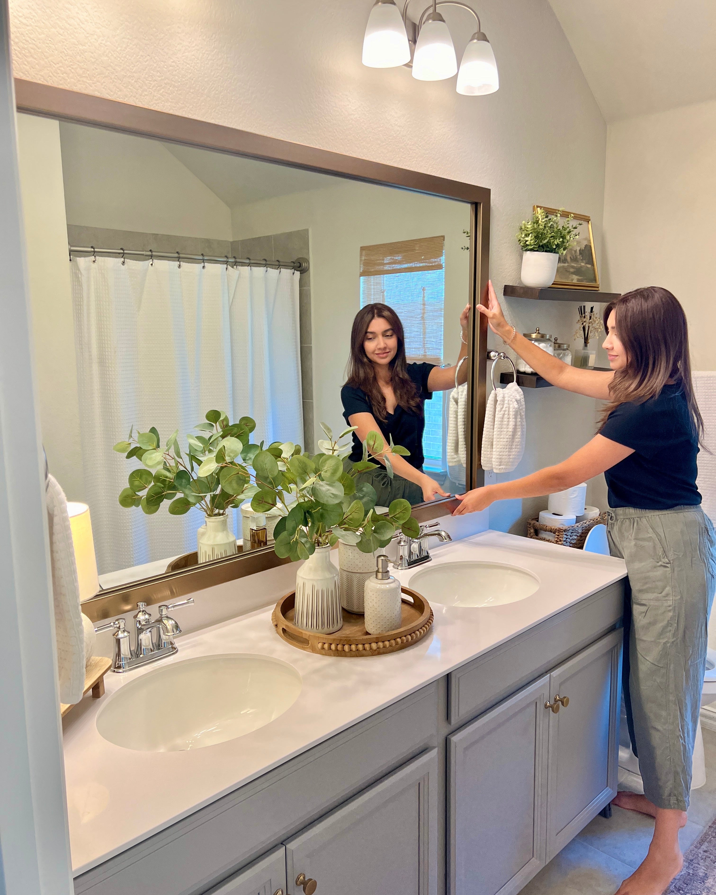
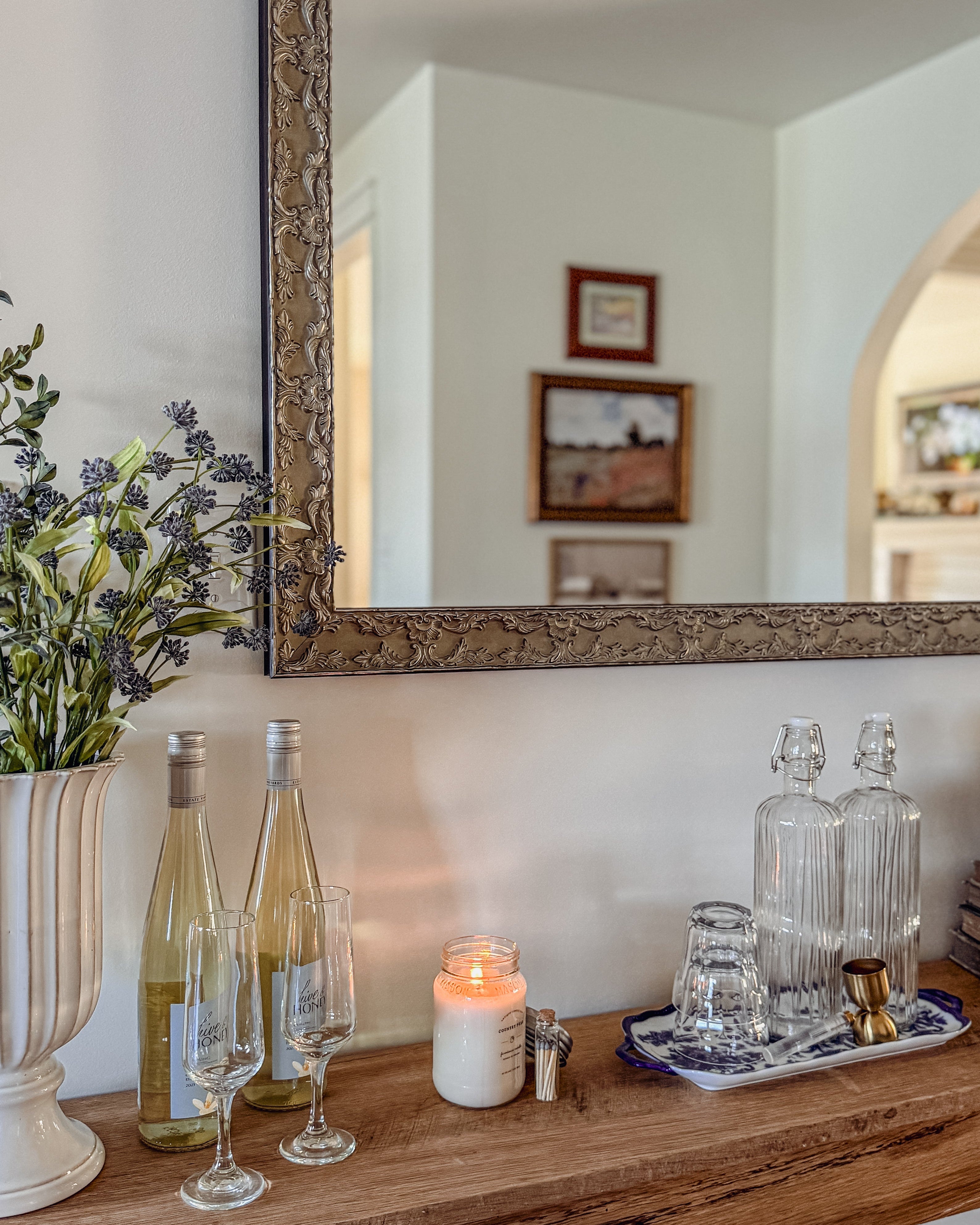
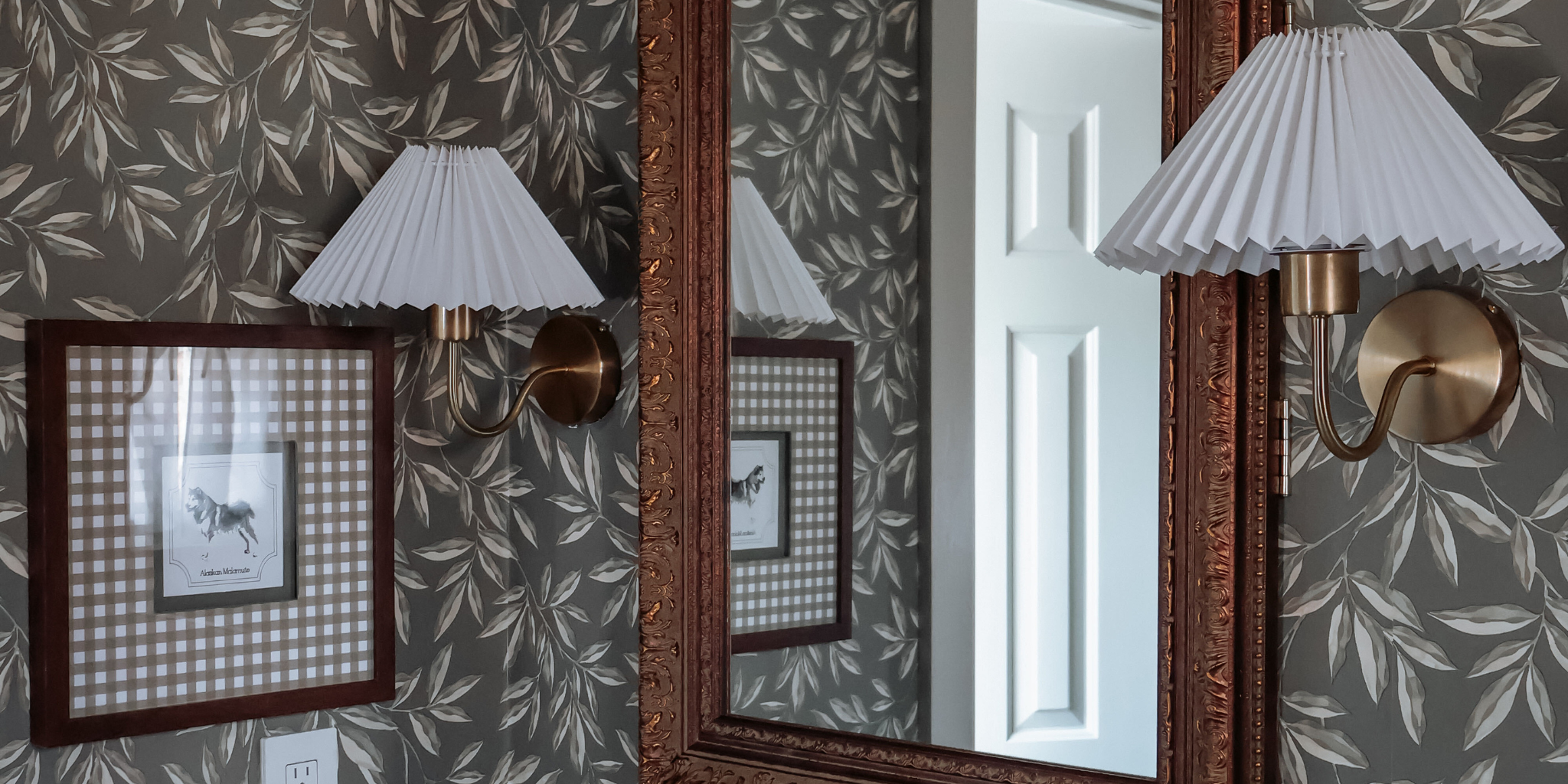
- Use warm and cool tones for balance. To avoid a design scheme looking flat or too predictable, incorporate a mix of warm-toned and cool-toned colors and finishes to create harmony in a space. Some examples include: cane-back wooden chairs (warm), a black wrought-iron light fixture, and a custom pewter framed mirror (cool).
- Use neutrals as a bridge. Understated colors can serve as a wonderful “canvas” for your space, helping to balance out and ground your bolder color choices. Using a transitional neutral color from one room to the next can also help create an overall feeling of cohesion, even though decor may vary widely from one room to another.
- Factor in various textures and finishes. Using color well often isn’t about using MORE colors, but different textures in the same hue. Consider adding in layers of plush, sleek, earthy, and organic, you can create a cozy, lived-in look on any scale. For example, pair your beige crushed-velvet sofa with a sleek glass and gold coffee table, all atop a neutral, earthy jute or seagrass rug layered with a smaller faux fur rug. You may also like: How to Mix Textures and Patterns to Elevate Your Space.
- Test before you commit. Paint swatches, rugs with a generous return policy, wallpaper samples—all of these things exist to make your life easier in the long run. It may take extra time to try things out before committing, but it’s smart to do a little at a time to make sure you love every element. When it comes to wall color, don’t forget to look at it closely at various times throughout the day as the light changes!

TIP: Did you know that you can try out our frames before you buy? Peruse 60+ frame styles and finishes to shop standalone favorites, or opt for one of our carefully curated Sample Bundles, which feature top sellers in a particular category. This allows you to get a real, in-person feel for what works in your space before taking the plunge.
Explore all samples now. Happy decorating!